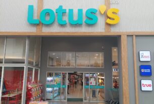
 Ever wondered about the apostrophe in Wall’s Ice Cream and Lotus’s?
The other day, I was sitting in my car outside one of the many convenience stores in Thailand when I spotted a large advertisement for Wall’s ice cream.
Just the day before I’d finished rereading Lynne Truss’ excellent bestselling punctuation guide Eats, Shoots & Leaves: The Zero Tolerance Approach to Punctuation.
I started thinking: ‘Is Wall’s a British company?’ and ‘Why is there an apostrophe in its name?’
That led me on to thinking about another familiar name here in Thailand: Lotus’s. Why is that spelt with an apostrophe, too?
As it turns out, the two brands have rather different explanations. So, let me explain.
Is Wall’s a British company?
Most British people will be familiar with Wall’s range of ice creams, including Cornetto, Magnum, Viennetta, and we were all brought up on Mr Whippy ice cream.
It turns out that Wall’s was founded in 1786 by Richard Wall, who opened a butcher’s stall in St James’s Market, London. The business remained in the family and was later run by Richard’s grandson, Thomas Wall II.
By the early twentieth century, the business faced a seasonal problem. Demand for its sausages, pies and other meat products fell during the summer, forcing the company to lay off staff.
In 1913, Thomas Wall II came up with an idea to combat the seasonal problem: why not make ice cream during the summer months to keep those employees in work? The First World War delayed the implementation of his idea, but in 1922 the company finally entered the ice cream business.
Wall’s has since become Britain’s best-known ice cream brand. However, it is no longer an independent British-owned business. It is now part of The Magnum Ice Cream Company N.V., a Dutch multinational headquartered in Amsterdam.
So why does Wall’s have an apostrophe?
In the case of Wall’s, the apostrophe is there for a perfectly good grammatical reason.
It indicates possession or association with a person: Richard Wall, the butcher who founded the business. In other words, Wall’s originally meant the ice cream (and other products) belonging to, or associated with, the Wall family.
The business subsequently developed into a much larger enterprise, eventually trading as Thomas Wall & Sons Ltd, but the original family name and its apostrophe remained.
In English grammar, adding an apostrophe followed by an ‘s’ is the conventional way of indicating possession or association with a singular name.
Some well-known British businesses have dropped their historical apostrophes over the years. Waterstones and Barclays are examples of companies whose names no longer use traditional possessive punctuation. Wall’s, however, has retained its apostrophe.
So why does Lotus’s have an apostrophe?
In our earlier article, Thailand’s and Malaysia’s LOTUS’S (grr!) supermarkets – LOTUS’ surely!, we explained how the retail chain acquired its current name.
In 2021, the Thai conglomerate Charoen Pokphand Group (CP Group) rebranded its Tesco stores in Thailand and Malaysia as Lotus’s. The business, previously known under names including Lotus Supercenter, Tesco Lotus Supercenter and Tesco Lotus, had originally been established in Thailand and was subsequently expanded into Malaysia following CP Group’s acquisition of Tesco Malaysia in 2020.
Well, it turns out that, unlike the brand Wall’s, the retail chain Lotus’s does NOT use an apostrophe for grammatical possession; instead, it is entirely a marketing symbol and corporate acronym.
When the CP Group acquired the retail chain back from Tesco and officially rebranded the stores from Tesco Lotus to Lotus’s, it intentionally designed the name around specific branding goals.
According to the company’s branding explanation, the apostrophe and final ‘S’ have been incorporated into the name for marketing purposes.
- The apostrophe is designed to resemble a digital location drop-pin, symbolising the company’s stores as physical destinations and its wider omni-channel retail offering.
- The ‘S’ stands for SMART: the final letter ‘S’ is an acronym for the company’s core values—SMART—which breaks down into: Simple, Motivated/Motivation, Agile, Responsible, Transformative (and Sustainability). The name Lotus’s is associated with its corporate philosophy and approach to business.
So, rather than being a grammatical possessive, the apostrophe is effectively a branding device!
Not surprisingly, this explanation has attracted a fair amount of criticism and amusement. Some people have questioned the logic of using a symbol that looks exactly like a traditional possessive (as if it means ‘belonging to Lotus’), while others have criticised the corporate explanation. On platforms like Reddit, some users view the branding choice as awkward corporate jargon that essentially masks a grammatical error.
And, of course, the extra ‘S’ has not fundamentally changed how many people pronounce the name. You will still hear Thai people referring to the supermarket as ‘Lotad’, using the familiar Thai pronunciation, rather than anything like ‘Lotus’s’.
Two brands, two very different apostrophes!
So there you have it.
Wall’s has an apostrophe because of its history and its association with the Wall family. Lotus’s, on the other hand, has an apostrophe because somebody in a corporate branding department decided that it would make a good marketing symbol!
I would have loved to have been sitting in that branding meeting when someone first suggested changing the name to Lotus’s and then proceeded to explain why the unusual apostrophe was necessary: being from the construction industry, I think I would have wet myself laughing!
Google Translation:
[We apologise if any of the translation is incorrect: google Translation occasionally gets it wrong]
เคยสงสัยไหมว่าทำไมชื่อแบรนด์อย่าง Wall’s Ice Cream และ Lotus’s ถึงมีเครื่องหมายอะพอสทรอฟี (apostrophe) อยู่ด้วย?
วันก่อน ขณะที่ผมนั่งอยู่ในรถหน้าร้านสะดวกซื้อแห่งหนึ่งในประเทศไทย ผมเหลือบไปเห็นป้ายโฆษณาขนาดใหญ่ของไอศกรีมยี่ห้อ Wall’s
บังเอิญว่าก่อนหน้านั้นเพียงหนึ่งวัน ผมเพิ่งอ่านหนังสือเรื่อง *Eats, Shoots & Leaves: The Zero Tolerance Approach to Punctuation* ซึ่งเป็นหนังสือขายดีที่ให้ความรู้เรื่องเครื่องหมายวรรคตอนได้อย่างยอดเยี่ยม เขียนโดย Lynne Truss จบลงพอดี
ผมจึงเริ่มตั้งคำถามขึ้นมาว่า “Wall’s เป็นบริษัทสัญชาติอังกฤษหรือเปล่า?” และ “ทำไมในชื่อถึงมีเครื่องหมายอะพอสทรอฟีอยู่ด้วย?”
นั่นทำให้ผมนึกถึงอีกชื่อหนึ่งที่คุ้นเคยกันดีในไทย นั่นคือ Lotus’s ซึ่งก็มีการใช้เครื่องหมายอะพอสทรอฟีเช่นกัน เหตุใดจึงเป็นเช่นนั้น?
ปรากฏว่าทั้งสองแบรนด์มีที่มาที่ไปแตกต่างกันครับ เดี๋ยวผมจะเล่าให้ฟัง
Wall’s เป็นบริษัทสัญชาติอังกฤษจริงหรือ?
คนอังกฤษส่วนใหญ่ย่อมคุ้นเคยกับไอศกรีมภายใต้แบรนด์ Wall’s เป็นอย่างดี ไม่ว่าจะเป็น Cornetto, Magnum หรือ Viennetta และพวกเราทุกคนต่างก็เติบโตมาพร้อมกับไอศกรีม Mr Whippy
แท้จริงแล้ว Wall’s ก่อตั้งขึ้นในปี ค.ศ. 1786 โดย Richard Wall ผู้เปิดแผงขายเนื้อสัตว์อยู่ในตลาด St James’s Market กรุงลอนดอน ธุรกิจนี้ดำเนินสืบต่อกันมาภายในครอบครัว โดยในเวลาต่อมาได้ตกทอดมาถึง Thomas Wall II หลานชายของ Richard
ในช่วงต้นศตวรรษที่ 20 ธุรกิจนี้ประสบปัญหาเรื่องฤดูกาล กล่าวคือ ความต้องการไส้กรอก พาย และผลิตภัณฑ์เนื้อสัตว์อื่นๆ ลดลงในช่วงฤดูร้อน ทำให้บริษัทจำเป็นต้องลดจำนวนพนักงานลง
ในปี ค.ศ. 1913 Thomas Wall II จึงเกิดแนวคิดที่จะแก้ไขปัญหานี้ โดยเสนอว่าทำไมไม่ลองผลิตไอศกรีมในช่วงฤดูร้อนเพื่อรักษาตำแหน่งงานของพนักงานเอาไว้ล่ะ? แม้ว่าสงครามโลกครั้งที่ 1 จะทำให้แผนการนี้ต้องชะงักไป แต่ในที่สุดบริษัทก็ก้าวเข้าสู่ธุรกิจไอศกรีมในปี ค.ศ. 1922
นับแต่นั้นมา Wall’s ก็กลายเป็นแบรนด์ไอศกรีมที่เป็นที่รู้จักมากที่สุดในอังกฤษ อย่างไรก็ตาม ปัจจุบัน Wall’s ไม่ได้เป็นธุรกิจอิสระของอังกฤษอีกต่อไป แต่เป็นส่วนหนึ่งของบริษัท The Magnum Ice Cream Company N.V. ซึ่งเป็นบริษัทข้ามชาติสัญชาติดัตช์ที่มีสำนักงานใหญ่อยู่ในกรุงอัมสเตอร์ดัม
แล้วทำไมชื่อ Wall’s ถึงต้องมีเครื่องหมายอะพอสทรอฟีด้วยล่ะ? ในกรณีของแบรนด์ Wall’s เครื่องหมายอะพอสทรอฟี (apostrophe) ที่ปรากฏอยู่นั้นมีเหตุผลทางไวยากรณ์รองรับอย่างชัดเจน
เครื่องหมายดังกล่าวบ่งบอกถึงความเป็นเจ้าของหรือความเกี่ยวข้องกับบุคคลคนหนึ่ง นั่นคือ Richard Wall ช่างขายเนื้อผู้ก่อตั้งธุรกิจนี้ กล่าวอีกนัยหนึ่งคือ เดิมที Wall’s หมายถึงไอศกรีม (และผลิตภัณฑ์อื่นๆ) ที่เป็นของหรือมีความเกี่ยวข้องกับครอบครัว Wall
ต่อมาธุรกิจนี้ได้ขยายตัวจนกลายเป็นกิจการขนาดใหญ่ขึ้น โดยใช้ชื่อทางการว่า Thomas Wall & Sons Ltd แต่ชื่อดั้งเดิมของครอบครัวพร้อมด้วยเครื่องหมายอะพอสทรอฟียังคงอยู่
ตามหลักไวยากรณ์ภาษาอังกฤษ การเติมเครื่องหมายอะพอสทรอฟีตามด้วยตัวอักษร ‘s’ เป็นวิธีมาตรฐานในการแสดงความเป็นเจ้าของหรือความเกี่ยวข้องกับชื่อเฉพาะที่เป็นเอกพจน์
ธุรกิจที่มีชื่อเสียงในอังกฤษบางแห่งได้ตัดเครื่องหมายอะพอสทรอฟีตามประวัติเดิมออกไปเมื่อเวลาผ่านไป ตัวอย่างเช่น Waterstones และ Barclays ซึ่งปัจจุบันไม่ได้ใช้เครื่องหมายแสดงความเป็นเจ้าของตามรูปแบบดั้งเดิมอีกต่อไป แต่สำหรับ Wall’s นั้นยังคงรักษาเครื่องหมายอะพอสทรอฟีเอาไว้
แล้วเหตุใด Lotus’s ถึงมีเครื่องหมายอะพอสทรอฟีอยู่ด้วย?
ในบทความก่อนหน้านี้ของเราที่ชื่อว่า “Thailand’s and Malaysia’s LOTUS’S (grr!) supermarkets – LOTUS’ surely!” เราได้อธิบายที่มาของชื่อที่เครือร้านค้าปลีกแห่งนี้ใช้อยู่ในปัจจุบัน
ในปี 2021 เครือเจริญโภคภัณฑ์ (CP Group) ได้ปรับเปลี่ยนแบรนด์ร้าน Tesco ในประเทศไทยและมาเลเซียใหม่โดยใช้ชื่อว่า Lotus’s ธุรกิจนี้ซึ่งเคยใช้ชื่อต่างๆ เช่น Lotus Supercenter, Tesco Lotus Supercenter และ Tesco Lotus นั้น เดิมก่อตั้งขึ้นในประเทศไทยและต่อมาได้ขยายสาขาไปยังมาเลเซีย หลังจากที่เครือเจริญโภคภัณฑ์เข้าซื้อกิจการ Tesco ในมาเลเซียเมื่อปี 2020
ปรากฏว่า Lotus’s ไม่ได้ใช้เครื่องหมายอะพอสทรอฟีเพื่อแสดงความเป็นเจ้าของตามหลักไวยากรณ์เหมือนกับกรณีของแบรนด์ Wall’s แต่เครื่องหมายนี้ถูกนำมาใช้เป็นสัญลักษณ์ทางการตลาดและเป็นตัวย่อขององค์กรโดยเฉพาะ
เมื่อเครือเจริญโภคภัณฑ์ซื้อกิจการร้านค้าปลีกนี้กลับคืนมาจาก Tesco และเปลี่ยนชื่อร้านจาก Tesco Lotus เป็น Lotus’s อย่างเป็นทางการ ทางบริษัทได้ออกแบบชื่อนี้ขึ้นมาโดยมุ่งเน้นไปที่เป้าหมายด้านการสร้างแบรนด์โดยเฉพาะ ตามคำอธิบายของบริษัท เครื่องหมายอะโพสทรอฟี (apostrophe) และตัวอักษร ‘S’ ที่ต่อท้ายเข้ามานั้น ถูกเพิ่มเข้าไปในชื่อแบรนด์เพื่อวัตถุประสงค์ทางการตลาด
เครื่องหมายอะโพสทรอฟีดังกล่าวได้รับการออกแบบให้มีลักษณะคล้ายกับหมุดปักตำแหน่งบนแผนที่ดิจิทัล (location drop-pin) ซึ่งสื่อถึงการที่ร้านค้าของบริษัทเป็นจุดหมายปลายทางที่จับต้องได้จริง รวมถึงสะท้อนถึงรูปแบบการค้าปลีกแบบออมนิแชนเนล (omni-channel) ของบริษัทอีกด้วย
ส่วนตัวอักษร ‘S’ นั้นย่อมาจากคำว่า SMART ซึ่งเป็นค่านิยมหลักของบริษัท โดยประกอบไปด้วยแนวคิดดังนี้: Simple (เรียบง่าย), Motivated/Motivation (มีความมุ่งมั่น/แรงจูงใจ), Agile (คล่องตัว), Responsible (มีความรับผิดชอบ) และ Transformative (พร้อมปรับเปลี่ยน/สร้างการเปลี่ยนแปลง) รวมถึงเรื่อง Sustainability (ความยั่งยืน) ด้วย ดังนั้น ชื่อ “Lotus’s” จึงมีความเชื่อมโยงกับปรัชญาองค์กรและแนวทางการดำเนินธุรกิจของบริษัท
กล่าวได้ว่า เครื่องหมายอะโพสทรอฟีนี้ไม่ได้มีไว้เพื่อแสดงความเป็นเจ้าของตามหลักไวยากรณ์ แต่เป็นกลยุทธ์ในการสร้างแบรนด์นั่นเอง!
ไม่น่าแปลกใจเลยที่คำอธิบายนี้จะก่อให้เกิดทั้งเสียงวิพากษ์วิจารณ์และความขบขัน หลายคนตั้งคำถามถึงตรรกะในการเลือกใช้สัญลักษณ์ที่ดูเหมือนเครื่องหมายแสดงความเป็นเจ้าของตามปกติ (ราวกับว่าหมายถึง “ของ Lotus”) ในขณะที่บางส่วนก็วิจารณ์คำอธิบายของทางบริษัท โดยบนแพลตฟอร์มอย่าง Reddit ผู้ใช้งานบางคนมองว่าการเลือกใช้ชื่อในลักษณะนี้เป็นเพียงศัพท์เฉพาะทางธุรกิจที่ดูแปลกประหลาด และเป็นเพียงการปกปิดข้อผิดพลาดทางไวยากรณ์เท่านั้น
และแน่นอนว่า การเติมตัวอักษร ‘S’ เข้ามานี้ ก็ไม่ได้เปลี่ยนวิธีที่ผู้คนจำนวนมากใช้เรียกชื่อแบรนด์ดังกล่าวแต่อย่างใด
และแน่นอนว่า การเติมตัว ‘S’ เข้ามานั้นไม่ได้เปลี่ยนวิธีที่ผู้คนส่วนใหญ่ออกเสียงชื่อนี้ไปแต่อย่างใด คุณยังคงได้ยินคนไทยเรียกซูเปอร์มาร์เก็ตแห่งนี้ว่า “โลตัส” (Lotad) ตามการออกเสียงแบบไทยที่คุ้นเคย มากกว่าที่จะเรียกตามชื่อใหม่ว่า “Lotus’s”
สองแบรนด์ กับเครื่องหมายอะพอสทรอฟี (apostrophe) ที่มีที่มาต่างกันโดยสิ้นเชิง!
สรุปก็คือแบบนี้นี่เอง
แบรนด์ Wall’s มีเครื่องหมายอะพอสทรอฟีเพราะมีประวัติความเป็นมาที่เกี่ยวข้องกับครอบครัว Wall ในขณะที่ Lotus’s นั้น มีเครื่องหมายอะพอสทรอฟีเพราะใครบางคนในฝ่ายสร้างแบรนด์ของบริษัทตัดสินใจว่า มันน่าจะเป็นสัญลักษณ์ทางการตลาดที่ดี!
ผมคงอยากจะเข้าไปนั่งอยู่ในที่ประชุมตอนที่มีคนเสนอให้เปลี่ยนชื่อเป็น Lotus’s แล้วอธิบายเหตุผลว่าทำไมถึงต้องมีเครื่องหมายอะพอสทรอฟีแปลกๆ แบบนี้ด้วย… ในฐานะคนที่ทำงานอยู่ในแวดวงก่อสร้าง ผมคงขำจนกลั้นไม่อยู่แน่ๆ!